7 Graphs and plots
There are two common ways to visualise data in R: either by using the straightforward but rather basic plotting commands from the Base package, or instead by delving into the more complex but much nicer looking functionalities of the ggplot package.
7.1 Distributional graphs for continuous variables
Plots such as histograms or box plots are a convenient way to gain a quick overview of the distribution of a variable and are easy to produce. Going back to the BSA data, we can plot the distribution of left-right political orientations scores with the hist() command.
The histogram should appear in the ‘Plot’ tab on the right hand side of the R Studio window. It shows us that political orientations are slightly skewed towards the left. The freq=FALSE option requires the y-axis to be expressed in terms of proportions rather than number of observations.
Titles and labels can easily be added:
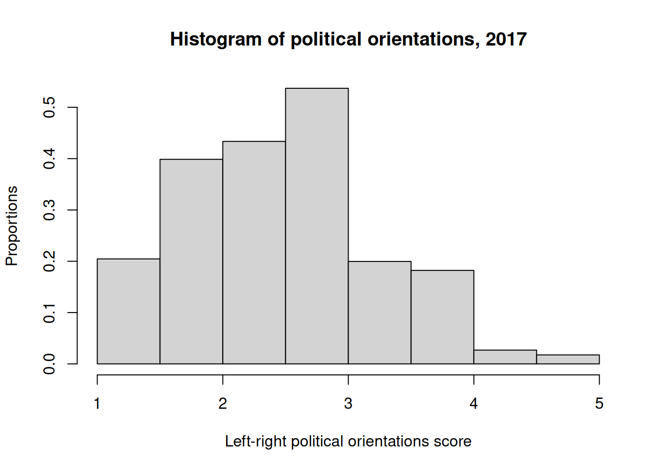
Note that main, ylab and xlab can be used with any Base R plot commands.
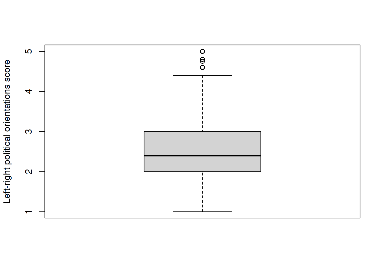
We can also produce a box and whisker plot of the same variable in order to get a better sense of the distribution of outliers:
The generic plot() command produces scatterplots. Let’s try it with our left-right political orientations score, in conjunction with libauth, a libertarian vs authoritarian scale.
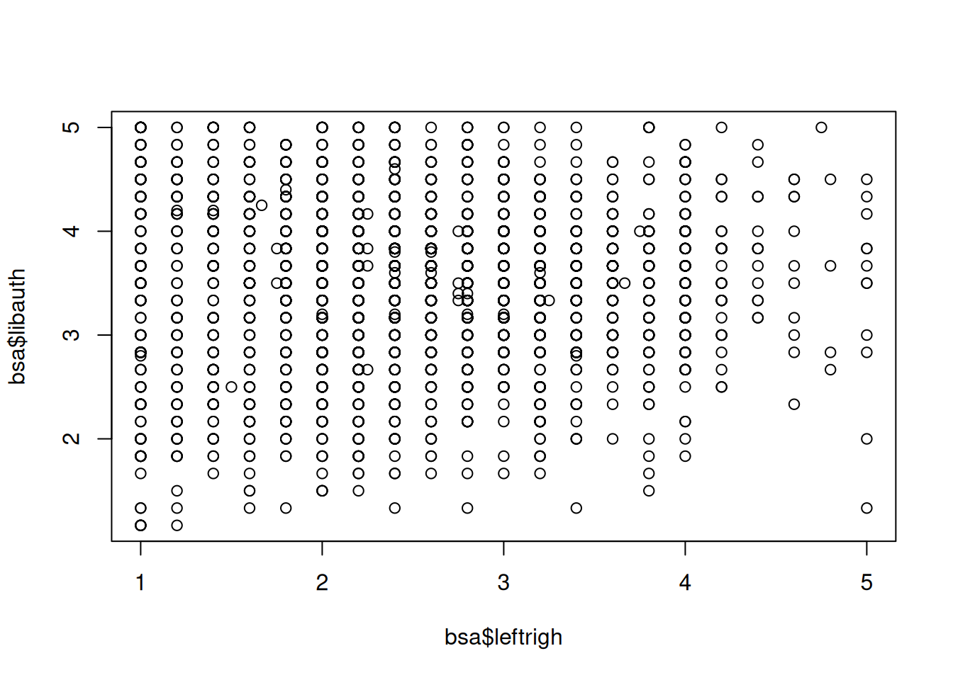
The scatterplot shows us that there is little association between the two variables. However, slightly fewer respondents simultaneously score high on the ‘authoritarianism’ and ‘right’ scales, perhaps unsurprisingly.
7.2 Plotting categorical variables
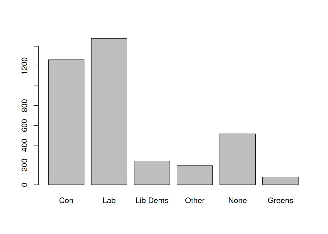
The generic plot() function provides a quick way to produce bar plots of categorical data. For example, we can examine the distribution of political party affiliations (Politics variable). In order to do this, we convert it into a factor (i.e. categorical) variable as previously. Some preliminary abbreviation of the factor levels are also required in order for them to be displayed properly.
More advanced plots require the barplot() function, which can be used in conjunction with table(). Whereas table() creates the data that will be plotted, barplot() does the actual plotting. For instance, we can produce the same bar plot, but this time with percentages, by creating a frequency table as we did above in Section 5.2, then plot it.
     Con      Lab Lib Dems    Other     None   Greens
33.5 39.2 6.4 5.1 13.7 2.1 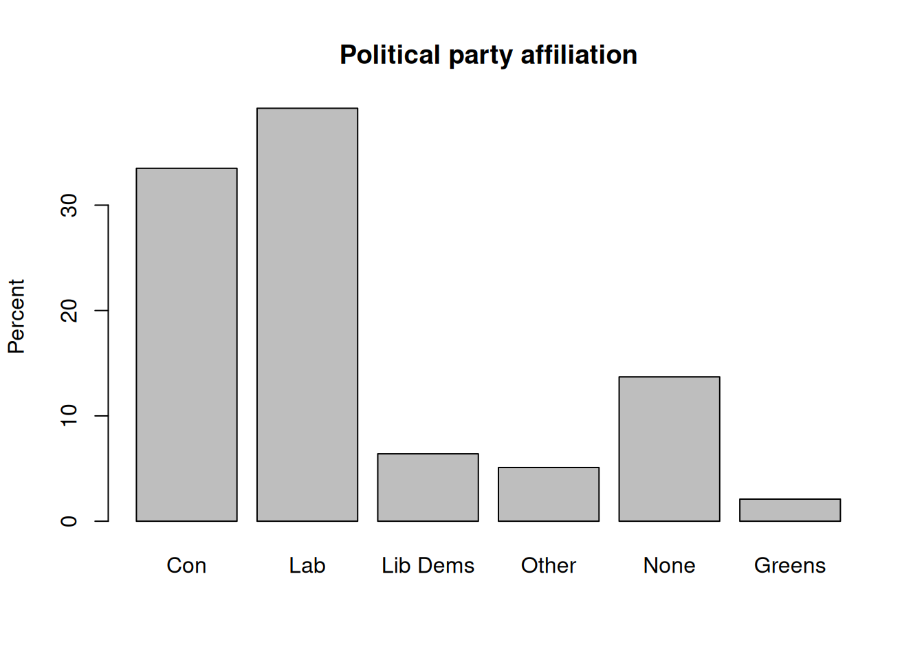
We can go further and create plots for two-way contingency tables of party affiliation by gender. This time we will do it in a single command:
#t<-xtabs(~PartyId2.f+Rsex.f,bsa)       # First, let's get the contingency table
t<-xtabs(~Rsex.f+PartyId2.f,bsa)       # First, let's get the contingency table
barplot(
  round(100*
          prop.table(t,2),              ## Column % (here, gender)
    1),               ## Rounded to 1 decimal
  beside = T,     ## Side-by-side bars
  main="Political party affiliation by gender",
  ylab="Percent")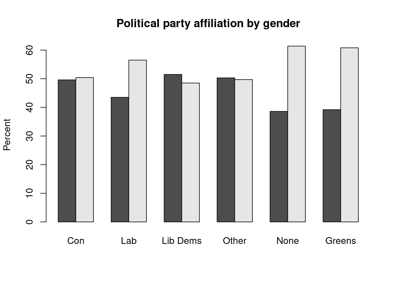
7.3 More advanced plots
Social science research often requires more advanced plots than just bar charts in order to conduct insightful analyses, such as for instance comparing the mean or median value of a continuous outcome across two or more categorical variables. The ggplot package provides one of the most advanced set of tools for data visualisation currently available. A few examples are provided below.
Three way barplots using ggplot2
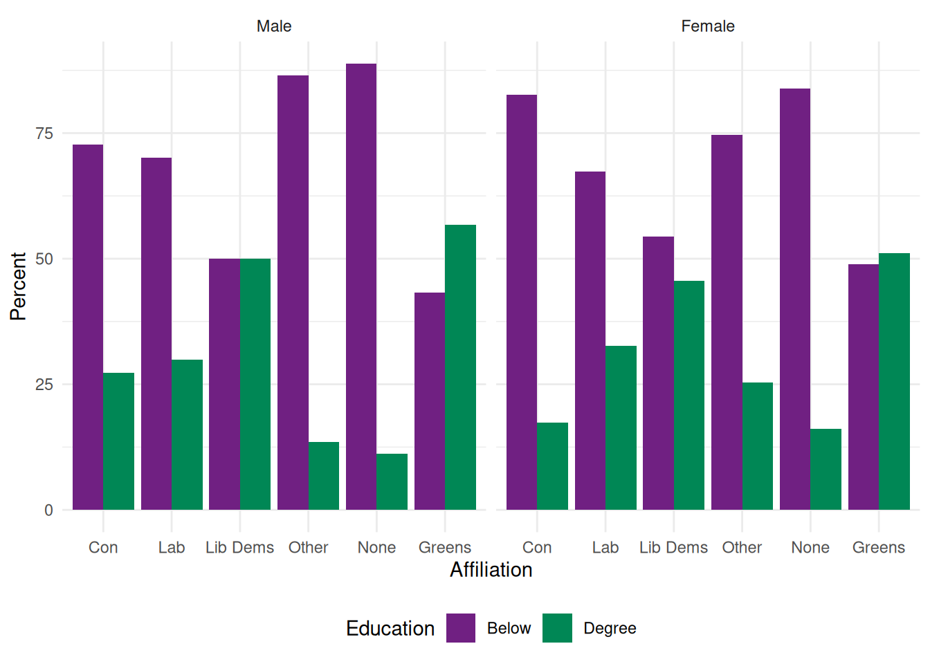
Say we would like to explore how differences in political party affiliations vary by gender and whether respondents have a degree-level education.
Let us first prepare the data: we need to create the table of result, the proportion of degree vs non degree holders by gender and political party. This is a three-way contingency table, that we can obtain with ftable() as shown in Section 5.2, combined with prop.table() for the computation of proportions and round().
As they are more straightforward to handle in ggplot, we convert the table object created by ftable into a data frame. Although it is possible to specify titles and axis labels in the plotting command, we will keep things simple and have them already in the data.
Rather than using the full range of educational achievements recorded in HEdQual3, we would like instead to have a dichotomic variable measuring whether respondents are degree holders or not. Adding it directly in the ftable command as a boolean expression return a dichotomic variable: “TRUE” for Degree educated respondents, and “FALSE” for everyone else. We just need to change the levels of this factor variable to make them more intelligible. Finally, we change the variable names in our data frame.
   Affiliation Gender Education Percent
1          Con   Male     Below    72.7
2          Lab   Male     Below    70.1
3     Lib Dems   Male     Below    50.0
4        Other   Male     Below    86.5
5         None   Male     Below    88.8
6       Greens   Male     Below    43.3
7          Con Female     Below    82.6
8          Lab Female     Below    67.3
9     Lib Dems Female     Below    54.4
10       Other Female     Below    74.7
11        None Female     Below    83.9
12      Greens Female     Below    48.9
13         Con   Male    Degree    27.3
14         Lab   Male    Degree    29.9
15    Lib Dems   Male    Degree    50.0
16       Other   Male    Degree    13.5
17        None   Male    Degree    11.2
18      Greens   Male    Degree    56.7
19         Con Female    Degree    17.4
20         Lab Female    Degree    32.7
21    Lib Dems Female    Degree    45.6
22       Other Female    Degree    25.3
23        None Female    Degree    16.1
24      Greens Female    Degree    51.1
We are now ready to plot the data. ggplot() functions usually work as a succession of layers or options that are added to an initial plot specification. Each extra layer is added after a + sign. In the example below, we specify the data and the aesthetic (i.e. the basic parameters of the plot) with the first command: the x and y variables as well as the first grouping variable, in our case education). geom_bar() stipulates the bar plot, with the ṕosition="dodge" option for the bars to be located side by side (position=“stack”would have them on top of each other). Finally, facet_wrap() splits the plot by gender.
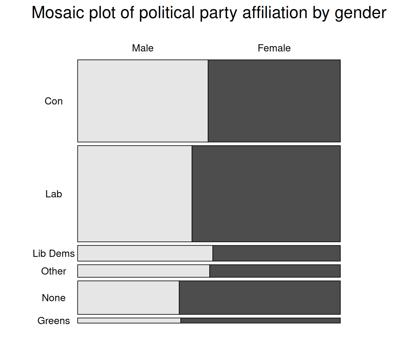
Mosaic plots
Mosaic plots provide a visualisation tool for two-way or more contingency tables. Table cells are plotted as rectangles whose surface is proportional to their overall number of observations whereas their length represents their frequency relative to that of the second variable for each category of the first one - this is equivalent to column percentages in a contingency table. In the example below, we are using the mosaic() function from the vcd package which provides both descriptive and model-based plots.
The basic parameters of a descriptive mosaic plot consist of:
- A R formula where the row and columns variables are specified;
- The highlighting variable, for the display of relative percentage;
- By default, the contrasting colours are shades of grey but can be customised, as can the direction of the bars.
Labelling options are a bit mode arcane than Base R plot functions. They need to be specified within a labeling= labeling_border() statement. See help(labeling_border) for more detail. We used Varnames=F to hide the variable names from the plot, rot_labels, to specify that we did not want any rotation of the value labels, and offset_labels to prevent them to overlap with the rectangles.
library(vcd)                # Loading the vcd package

mosaic(~PartyId2.f+Rsex.f,
       data=bsa,
       highlighting = "Rsex.f",
       labeling= labeling_border(varnames = F,
                                 rot_labels = c(0,0,0,0),
                                 offset_labels = c(0, 0, 0, 1)
                                ), # labelling functions from mosaic. See
                                   # help(labeling_border) for more detail
                    main="Mosaic plot of political party affiliation by gender"
              )